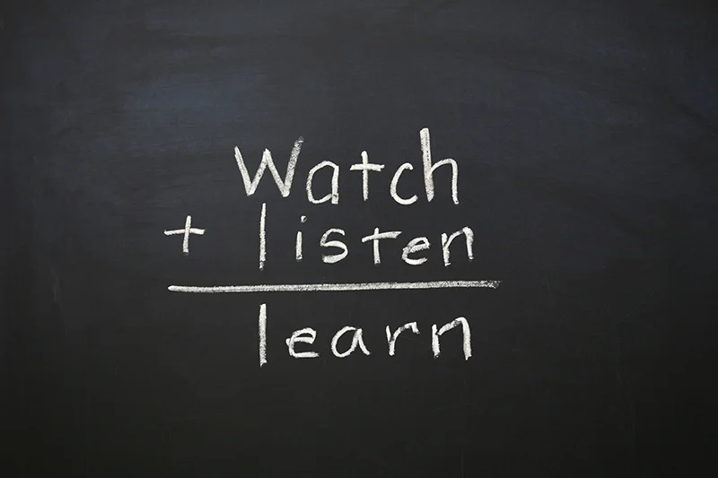
UX Design Life-Cycle, Part 2: Watch, Listen and Learn
Background
We are a small team of talented creatives and developers, answering the question: “...tell us about your process or design principles.”
We are going to do something far more valuable: write about what has worked and what has not worked.
In the weeks ahead, KRUTSCH will post a series of bite-sized articles that encapsulate a decade of experience leading the life-cycle of product design and user experience (UX), across a variety of industries, with clients both large and small, including consumer and commercial projects.
This is Part 2: Watch, Listen and Learn. You can read the introductory post here: UX Design Life-cycle, A Mini-Series.
Follow us on LinkedIn to see the next chapter in your feed.
Watch, Listen and Learn in Practice
Clients often come to us with their biggest problems. Whether they're persistent sticky obstacles, unforeseen challenges, or the ultimate beast: a new idea. Often overwhelmed, they're unsure where to start, what to keep, or what to abandon.
Re-designing a management app for a storage area network (SAN) remains one of our breakthrough projects. The client used to be a leader in the market for their product's ease of use but had since fallen in that category; a realization that most in the company were not eager to embrace.
We performed a comprehensive user experience research, interviewing a large number of customers, as well as field sales engineers and even sales prospects from lost deals. It was extensive. We literally spent six months in the field interviewing customers and assembling our conclusions.
Our interviews sparked the realization that that customers only used a handful of very basic features. It was eye-opening and the result was a decision to sharply tack-away from the previous product's kitchen sink approach.
Instead, we designed a slimmed-down feature set that would reduce complexity, ease learnability and emphasize recall-ability for overworked storage technicians. Customer interviews helped push past the prevailing belief with legacy apps, that everything is there for a reason. The belief that to not include every corner-case feature means that N-Zillion dollars in revenue is at risk (that’s zillion with a ‘Z’).
Equally eye-opening: the redesigned product won trade magazine Editor’s Choice awards and increased sales of the parent product, based on user experience alone. We learned to filter out the noise and really listen to what customers want – and it’s usually not a grab bag of features, it’s basic blocking and tackling stuff.
Quality Candor
Our UX design process breaks down big challenges by infusing fresh perspectives with proven tools and techniques. However, none of these tools or techniques are more insightful or guiding than a user study. Once you work to understand the problem, user studies recalibrate focus by uncovering key customer feedback and perceptions. They are the biggest driver of product innovation to create a competitive advantage.
It’s no surprise, then, that our most memorable moments as UX designers happened during user studies, while either interviewing customers pre-design or observing subjects, post prototype or implementation.
Here are some examples of what we’ve observed in user studies that became design drivers:
Subject opens a box, glances at the quick start guide, laughs and throws the placard on the floor
Subject calls a co-worker and asks: “…do you know how this works or how to set this thing up?”
Proctor is bitten by a test subject’s dog during the interview (yeah, this happened)
Subject’s toddler participates in the user test (most stressful test we’ve ever experienced)
Subject glares at you with a furrowed brow and tells you “…this fucking system makes me feel stupid …”
What a User Study Needs
Here’s the important point: a user study requires designers to watch, listen, and learn. Watch what goes on in the user’s environment as they complete a task, listen to the off-the-cuff, emotional reactions, learn how their context and habits inform their interactions. It’s the combination of these observations that fuel direction changing discoveries.
A Planning Framework
Over the years we’ve refined our user study process to be a catalyst for ‘eureka moments'. These moments strike when we discover something significant that neither we nor our client understood about the customer. They drive sweeping change to the design direction of a service, app or product. Each client is different, of course, but in general we follow the watch, listen, learn outline below to turn observations into insights.
How to Watch
Ditch the lab environment
To characterize the people who will use your product or service, you need to go out and meet them … in the field. A lab environment makes user test subjects nervous. Not nervous as in ‘fearing for my safety’, but nervous as in ‘I am being evaluated’… imagine test anxiety. Not ideal if you want to really know what they are thinking as you walk them through a test sequence.
Observe subjects one-on-one
Often, excited clients want to listen and learn with you, especially if they’re embarking on a user study for the first time. Do not let them come along. Their investment in the product invariably turns into well-intended interruptions and leading comments that can skew your interview and put the subject on edge. Additionally, avoid group interviews. Someone ends up dominating the conversation which leads to less feedback in quantity, quality, and candor.
Record your sessions
Time erodes and slants memories. Don’t rely on memory or pure notes to summarize your findings. Bring a camera along and record as much of the session as you can: voice, body language, surroundings, and product interactions. (Read about our favorite equipment and editing software.) As mentioned, all of these elements play into the user experience and the insights you’ll gather.
How to Listen
Stop analyzing
Don’t analyze while you listen to commentary from test subjects. Really listen and focus on understanding what the subject may be trying to tell you, but isn’t coming out clearly. Interviewing customers and observing test subjects, and doing it well, requires exceptional perception.
Listen to actions
A good listener understands what the speaker may be thinking or feeling, but is having difficulty expressing. They read body language or facial expressions that may indicate discomfort, confusion or disinterest. Good listeners observe the local environment – the place in which you are having the conversation. Sometimes an interview subject will describe an interaction or provide feedback that is better understood within the context of their own environment.
How to Learn
Learn from other people’s experiences
Ask about a subject’s background. We especially enjoyed observing one test subject; she was one of the most proficient users of an app/system observed over a two-week period. She was fluid with her computer, effortlessly switching between applications. She had a background doing paralegal work, which was obvious watching her work. It’s important to ask about and take note of the background of test subjects. It gives context to help understand what you are observing. I sometimes refer to this in my notes as to whether a subject has appropriate DNA for the task.
Let the user get off-task
Be prepared with an outline of tasks, but don’t be afraid to deviate. If an interview subject wants to go off-course and show you something, let them. We're often surprised during user tests or interviews when a subject tells or shows us something that had never occurred to us – this is when eureka design moments happen.
End Note
Share your experiences in the comments section – we are all here to learn.
Follow us on LinkedIn to see the next chapter in your feed.
Emma Aversa is a visual designer at KRUTSCH, with a background in architectural design. She excels at digital design and communication executed through simple, function-forward solutions.
Ken Krutsch is Founder & Managing Principal of KRUTSCH, a digital product design firm, specializing in commercial product vision and realization, including customer research, roadmap development and full-stack user experience design.
Follow KRUTSCH on LinkedIn to read the follow-up posts in the series.


