UX Design Life-Cycle, Part 1: Understand the Problem
Background
We are a small team of talented creatives and developers, answering the question: “...tell us about your process or design principles.”
We are going to do something far more valuable: write about what has worked and what has not worked.
In the weeks ahead, KRUTSCH will post a series of bite-sized articles that encapsulate a decade of experience leading the life-cycle of product design and user experience (UX), across a variety of industries, with clients both large and small, including consumer and commercial projects.
This is Part 1: Understand the Problem. You can read the introductory post here: UX Design Life-Cycle, A Mini-Series.
Follow us on LinkedIn to see the next chapter in your feed.
Understanding the Problem: An Example
Many years ago, I was a newly appointed leader of an engineering organization that developed custom hardware and software. We were a mid-sized storage area networking (SAN) vendor.
A project I inherited was for a new, low-cost/entry-level storage array. For those that haven’t worked in storage, this means an enclosure with a ½-dozen hard drives, arrayed together to present storage volumes to servers (i.e. shares, LUNs, “drive letters”).
As the newcomer to the project, I started with the internal stakeholders, making sure I understood what everyone wanted.
Product Management: we want a low cost, high-density – what we called “cheap and deep” – to allow the sales teams to submit a very low entry cost product in response to an RFP (request for proposal).
Sales: we want a lower cost version of our current, flagship product.
Engineering: we are already half-way into the project and are committed to using the following hardware and software stack.
The CEO: we’ve committed to launching this new product on a particular quarter; making that target, within budget, is paramount.
So, away we went on our white-knuckled ride, jamming square pegs into round holes. We made the date and we stayed within budget. The CEO even threw a big launch party. Everyone was happy.
Shortly after launch, I started looking at the sales metrics. Then, I started talking to field sales engineers. Yeah, we sold a few, but some were returned, and the product was effectively dead within a year.
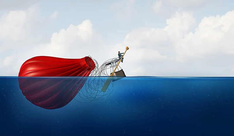
Why? Simple: we were solving the wrong problem.
Have you ever heard the phrase: Quality, Speed, Price, pick any two?
Choosing Between Quality, Speed, Price in UX Design: Pick Any Two
The expectation of “cheap and deep” really means picking Quality and Price – high storage density at a low cost. But what the sales team was actually selling was: Speed and Price – like the flagship product, in terms of performance, but smaller and less expensive.
I will never forget the conversation I had with one of the leading field sales engineers, months later.
Sales Engineer: customers thought they were getting a smaller edition of the full version product, but the performance wasn’t there.
Me: you wouldn’t believe the obstacles we had to climb to build it the way it was shipped.
Sales Engineer: Oh, like what?
Me: We had all kinds of protocol issues, plus nearly unsolvable heat and vibration challenges. I wanted to use lower capacity, higher performance drives, but that would have been less storage and higher cost. It would have been quicker to develop with higher performance and reliability. I was told “no way – Engineering promised us cheap and deep”.
Sales Engineer: That’s too bad, because the product you described would have been a hit. Our customers don’t want cheap and deep – they just want a little less cost and smaller scale, but with similar performance.
Lessons Learned
I have seen similar versions of the above play out, over and over. Planning for the development of commercial products is very, very hard. In my experience, it is more difficult than the actual development process.
Fast forward to today, leading a small team of talented creatives and developers, I dig deep on the product requirements. Our clients come to us to help them realize their vision for a better tomorrow – at least, within the context of their products and services.
I have learned to be polite but firm on an agency policy of not proceeding with design work until we have performed due diligence – competitive analysis, a customer and/or end-user study.
Because solving the wrong problem destroys organizations and professional relationships.
A Framework for Understanding a UX Design Problem
The following is a process that we have used successfully and refined over the years. Each client is different, of course, but in general we follow the outline below to critically understand the problem domain and to make meaningful product recommendations.
The KRUTSCH Process
1. Workshop Sessions & Heuristic Review
2. Interview Sessions
3. Summarization and Recommendations
Workshop Sessions
We start with a heuristic review, or a usability inspection, of a representative selection of the client’s products or services. This helps us to identify obvious problems with the current offering experience. While not a requirement for the steps to follow, the best time to conduct such a review is when we have had the least exposure to the day-to-day usage of a client’s existing products.
Next, we follow with internal workshop-like meetings, with client stakeholders and subject domain experts. The focus of these workshop meetings is to educate our team on the current state of systems being used in the field, from the viewpoint of the client’s internal subject matter experts.
This step is crucial, prior to interviewing existing or potential end-users. In our experience, interviewing harvests far more information when the interviewer has a good working knowledge of the business problem domain.
Interview Sessions
We often separate the customer population into groups, based on their role or persona. Then, we compile a representative list of 6-12 subjects from each of the groups. In our experience, six persons from each group of test subjects is enough to uncover important issues and to separate quirks from common behaviors. That is, to filter unusual customer experiences from what is the norm.
We compile an informal question outline and interview each subject, one-on-one, as quickly as we are able to schedule the meetings. We video record each interview for internal research and summarization. In-person interviews often produce the best results, but we have been successful performing qualitative research using GoToMeeting with remote subjects.
Summarization and Recommendations
Finally, we conclude with a summary presentation that includes specific observations, supported by video clips from interviews, as well as how customers and end-users perceive the current products or service, finishing with concrete recommendations for next steps.
End Note
Share your experiences in the comments section – we are all here to learn.
Follow us on LinkedIn to see the next chapter in your feed.
Ken Krutsch is Founder & Managing Principal of KRUTSCH, a digital product design firm, specializing in commercial product vision and realization, including customer research, roadmap development and full-stack user experience design.
Follow KRUTSCH on LinkedInto read the follow-up posts in the series.


