UX Design Life-Cycle, Part 4: Choose Design Patterns and Sketch Out a Story
Background
We are a small team of talented creatives and developers, answering the question: “...tell us about your process or design principles.”
We are going to do something far more valuable: write about what has worked and what has not worked.
In the weeks ahead, KRUTSCH will post a series of bite-sized articles that encapsulate a decade of experience leading the life-cycle of product design and user experience (UX), across a variety of industries, with clients both large and small, including consumer and commercial projects.
This is Part 4: Choose Design Patterns and Sketch Out a Story. Introductory post: UX Design Life-cycle, A Mini-Series.
Follow us on LinkedIn to see the next chapter in your feed.
Creating Recognizable UX
Innovative products demand a next-gen user experience. But next-gen doesn’t mean unrecognizable. It’s the reason that the first computer with a graphic user interface contained a ‘desktop’. The label pulled on the user’s formed expectations about the physical desktop uses–a space for working, organizing, and providing easy access–and applies them to the digital. A digital workflow pattern emerges around those expectations. This special balance of meeting expectations while reorganizing workflows creates successful and innovative UX experiences.
Build a Reusable Design Pattern
Looking back over our 15 years in business, we’ve worked with clients across many backgrounds. We built out-of-the-box and management systems for enterprise storage. We dove into social media and developed a voice-over app for photo sharing. We tackled clinical trial patient registration and documentation in the health sector. We connected job candidates to their background screening progress. We received a patent on our work with a commercial router. It’s a diverse mix.
However, across all of our projects, we leaned on a handful of design patterns to organize information and move the user towards the main success scenario. Recognizing these patterns allowed us to create a faster, clearer framework for iteration. These reusable design patterns are more than visual templates, they are tested human interaction models. They slash time required to assemble early versions of your digital story.
These patterns succeed because, like the desktop, they play to the expectations that people form based on past experiences. By following the principle of least astonishment, they serve as the ‘familiar’ counterweight to the ‘innovative’ side of design, helping to strike the balance of usability.
Creating Design Patterns
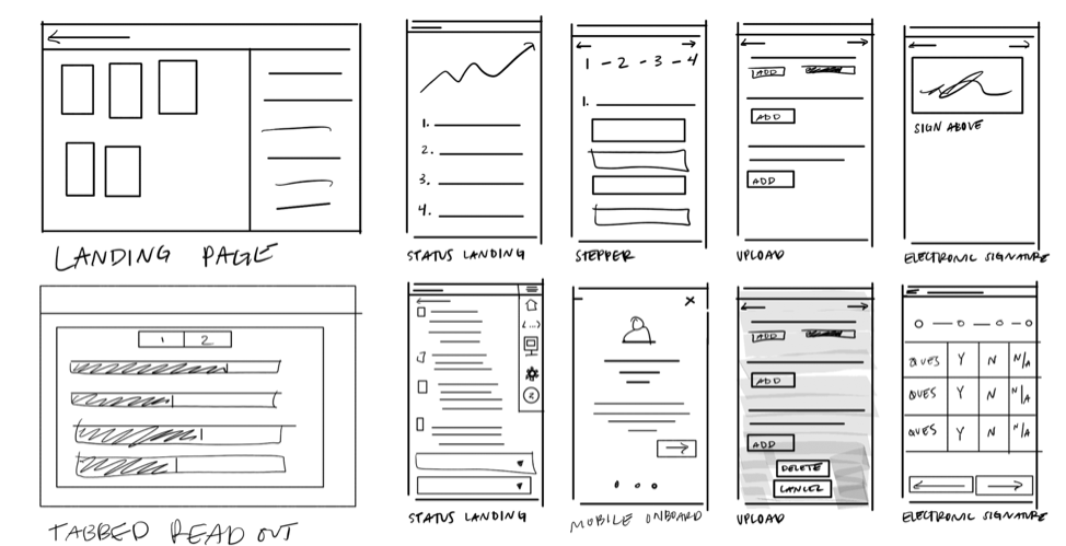
Armed with our design patterns, we’re able to create a framework for organizing and navigating between complex workflows. Then, we begin to sketch out a story using quick sketch-style wireframes to fill in the details and test out ideas. This allows us to provide clients with an early preview so they can give candid feedback. Sometimes feedback may be collected from customers and real end-users or is limited to internal stakeholders. There is a place for each.
How to Leverage the Right Pattern
Different patterns satisfy different needs. We organize ours into four categories:
Non-Linear Information Patterns
Linear Patterns
Data Patterns
Feedback Patterns
DocuPad – digital preview pattern in both Portrait and Landscape modes
To leverage the right pattern, first clarify specific use cases. In an earlier post, we addressed best practices of how to do this through user research and defining the feature set and workflow. Once defined, ask the following sample questions for selecting patterns. Does the user need to:
Navigate between complex workflows? (Top Navigation or Side Navigation)
See information both at a glance and in more detail? (Dashboard, Landing Page, or Expanding Table)
Utilize stash-able space for editing or reviewing? (Document Pad or Expanding Panel)
Navigate a workflow in an easy to digest, controlled, or specific order? (Vertical or Horizontal Stepper)
Organize or edit large amounts of data? (View by Tag, Tiled View, Table View)
Receive feedback at certain points of the workflow? (Error Tracking or Sunburst)
Sketch a Story to Test the Patterns
Using the chosen patterns, start filling in the details by sketching out a happy path story. Sketches can be done by hand or via tablet. Draw out general steps of the workflow, without committing too much detail. Quick is key. Collect feedback from the users, reiterate, and repeat. Rapidly test and reset course early as needed.
Using patterns and sketching a story doesn’t just help the process move faster, the client also begins to envision their product faster. The iterations work to level the scale between meeting expectations and providing an innovative, next-gen user experience.
End Note
In our upcoming post, Part 5, Establish a Visual Language, we will demonstrate going from patterns and sketches to a high-fidelity visual language, which establishes visual cues used across the entire application or system.
Follow us on LinkedIn to see the next chapter in your feed.
Emma Aversa is a visual designer at KRUTSCH, with a background in architectural design. She excels at digital design and communication executed through simple, function-forward solutions.


