NECPRS
Nebraska Early Childhood Education Record System verifies professionals’ credentials, pushes training opportunities, and centralizes personal records.
Product Strategy | User Study | Features and Workflow | UX/UI Design | Interactive Prototype | Front-End Development | Product Testing
About
The Nebraska Early Childhood Professional Record System determines a child care program’s standing in Step Up to Quality, a rating and accreditation process that promotes the highest level of care for Nebraska’s children.
Directors build and manage programs in the record system. Employees connect to their employer’s program, build their professional record, and register and track training hours for verification.
The Goal
NECPRS wanted to engage their busy users where they were—on their phone—while refreshing their UI and workflows to better serve their diverse, non-tech savvy user base.
The Design Focus
Make trainings easy to browse on the go
Easily submit and track verified training hours
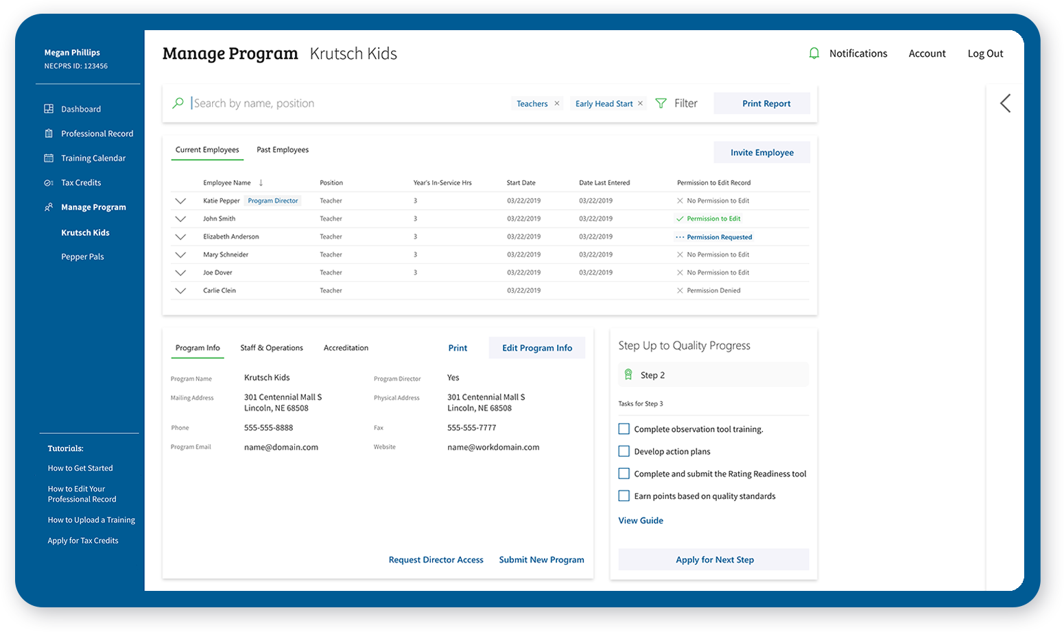
Manage program’s employees and submit Step Up to Quality progress
Designing the App
User Study First
Our app needed to focus on the needs of its diverse user base: directors, teachers, licensed child care home providers, licensed child care center providers, public school providers.
30 minute sessions | set tasks | one-on-one interviews
Top takeaways from user study:
Mobile Friendly Management
Streamlined, role-based onboarding
Enhance training calendar and discovery
Clear Navigation and organization
Program and employee monitoring
Product Strategy, Feature Set and Workflow
The new app focuses on mobile friendly training discovery, record managing, and certificate uploading. Visual, agenda style training lists allow on-the-go browsing.
Main Success Scenarios
Directors/Owners want to register their program for Step Up to Quality within the record system, then track program and employee progress and apply for next Steps.
Providers/Teachers want to keep a centralized, updated record of professional development by tracking progress, finding education opportunities, and verifying certifications.
UI/UX Design: Sketches to Screens
Designing a new visual language starts with sketching and evolves into pixel-perfect screen designs. Collaborative iterations and client reviews fill in the final design details.
Original Portal Page
Portal Page Concept Sketch
Implemented Design
Final Product
Our final user tests of the new design demonstrated the following:
The visual language and organization made it easier for new and returning users to navigate and learn the system.
Mobile-friendly training uploads and training calendars met users where they were, empowering them to stay on track with their professional development hours.
New features like shared editing permissions and profile links felt synced up to user needs and future expectations.
Step Up to Quality progress tiles centered their program’s goals and helped users focus on their next tasks.


