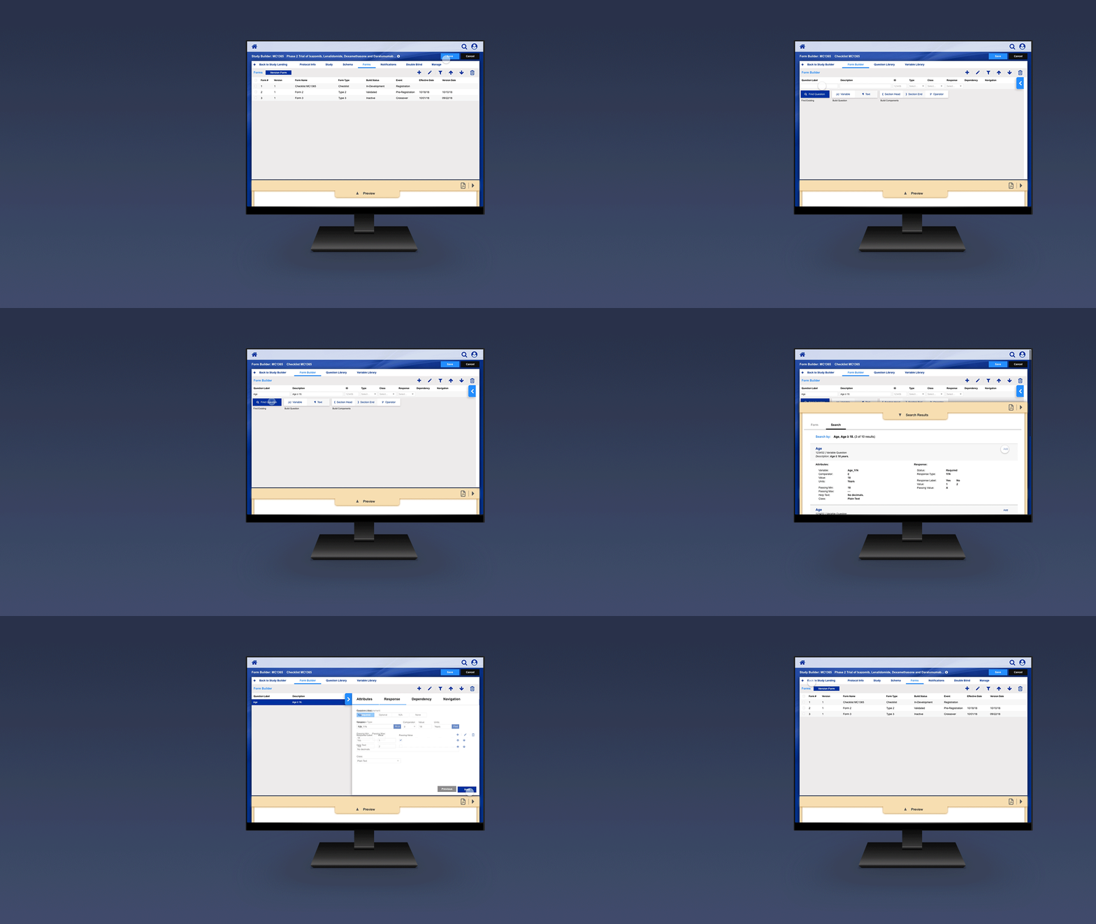
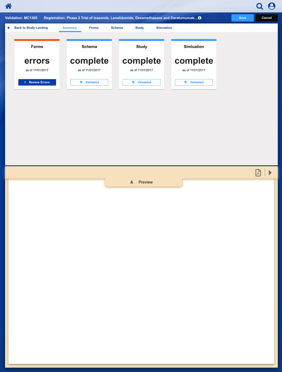
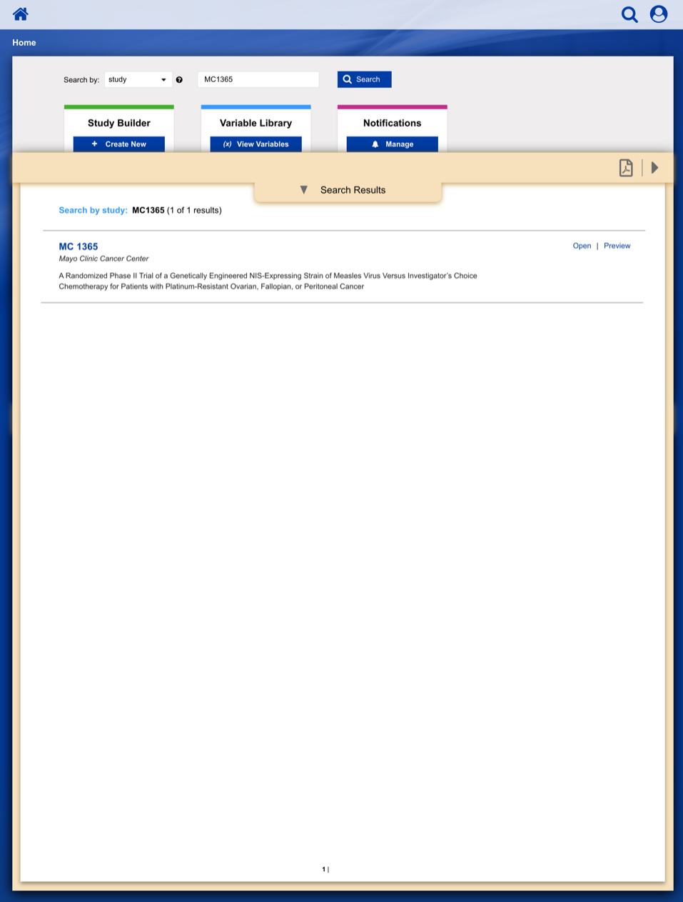
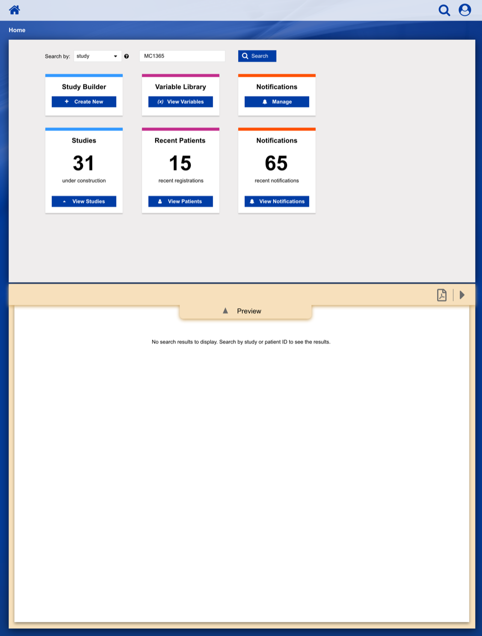
Overview
The Patient Registration application is designed to replace 30 years of incrementally developed paper-driven process and legacy software. A main design focus was to augment a largely paper-driven process with a digital equivalent, yet still feel familiar to a diverse user population.
Goals & Requirements
• Enable study staff to enter eligibility checklist data and determine site compliance and patient eligibility for a given clinical trial.
• Communicate patient, site and related regulatory data to the persons responsible for study conduct.
• Communicate enrollment output (treatment assignment, patient ID, enrollment notes) back to study staff.
• Provide a central location to enroll patients on clinical trials with our healthcare client acting as the statistical and data center.
Main Success Scenario:
Using a paper metaphor for a digital system, seamlessly create, manage and track a clinical study or patient.
Accelerate processes and communications while systematically reducing errors.
UX/Design Highlights
We performed the initial user experience research, interviewing study staff and clinical research coordinators, followed with iterative design work, co-developed with product owners.
Our team of seasoned user interface developers built a working set of “Reference Pages” (i.e. working web app) that the client’s own development engineers merged into a newly developed back-office system, as features were being developed.
Using our working “Reference Pages” we were able to conduct usability studies ahead of full feature implementation by the client’s product team.

Business & Workflow Analysis
Based on our extensive qualitative research of study staff and coordinators, we examined the system architecture and business rules to fully understand and appreciate the requirements.
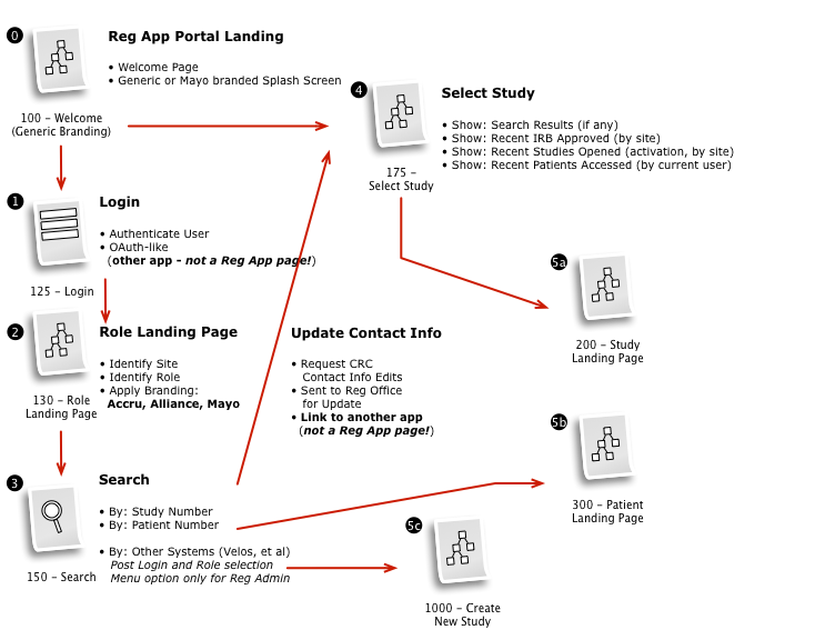
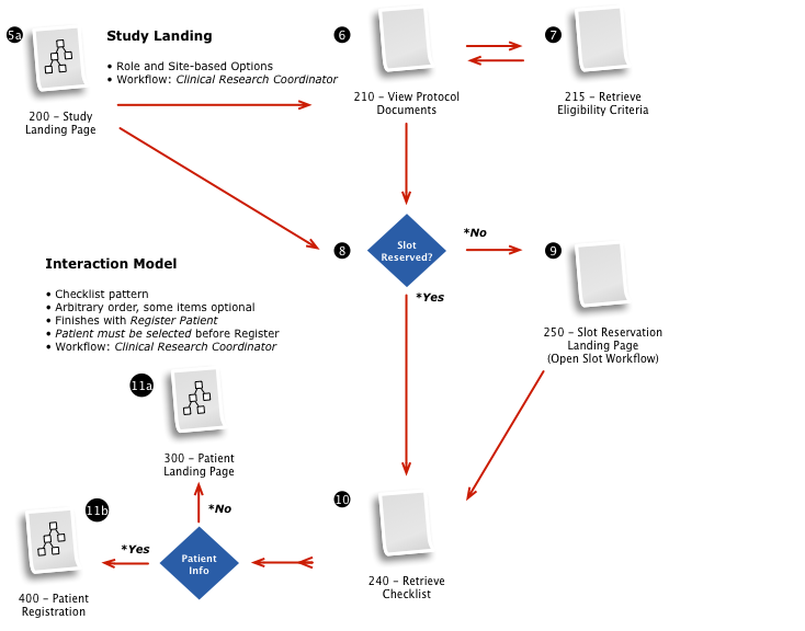
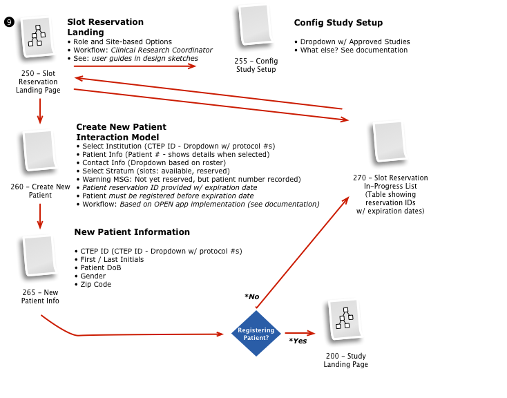
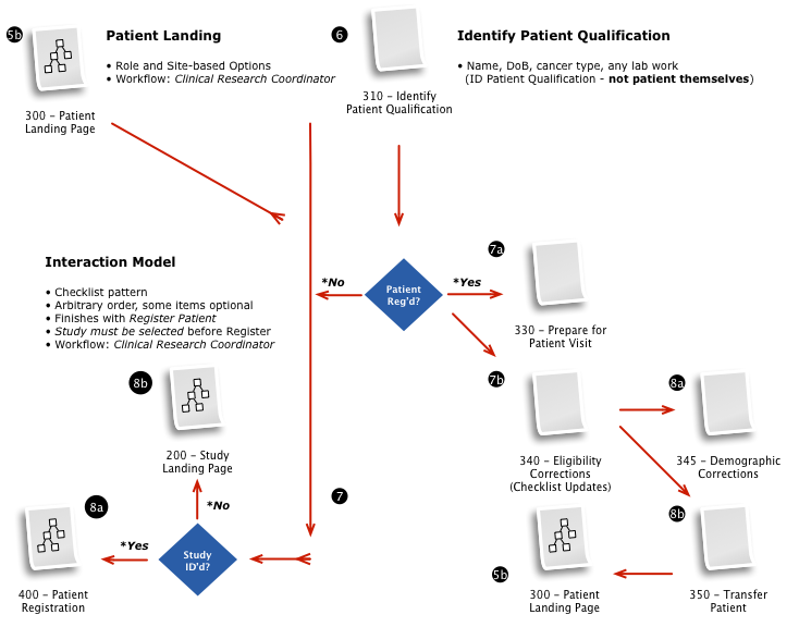
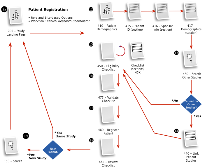
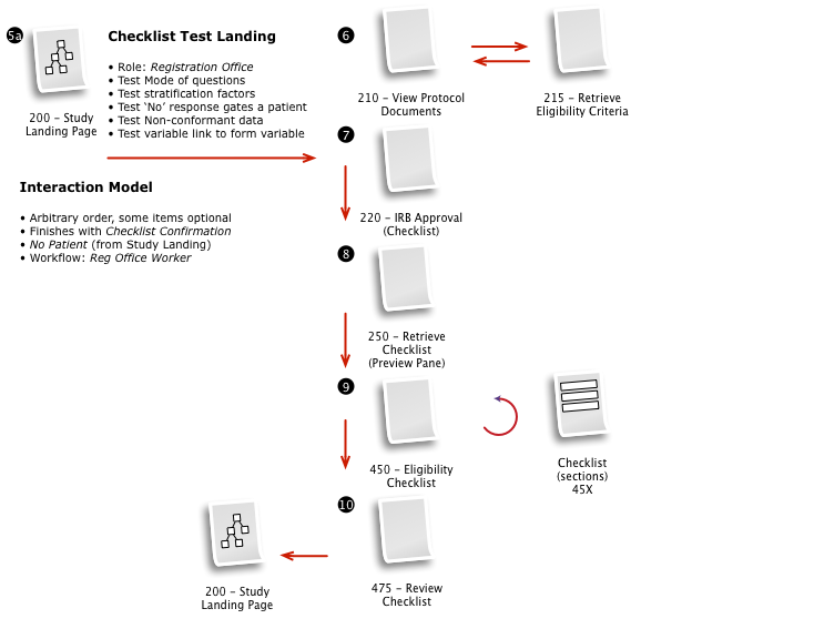
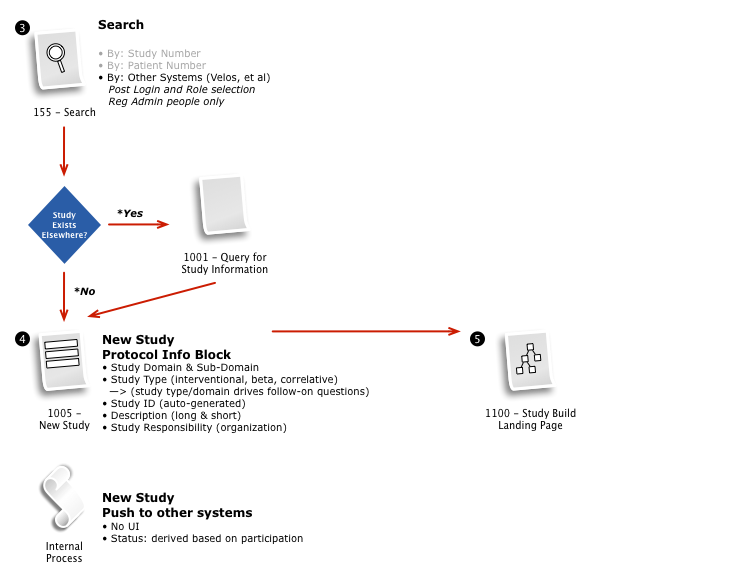
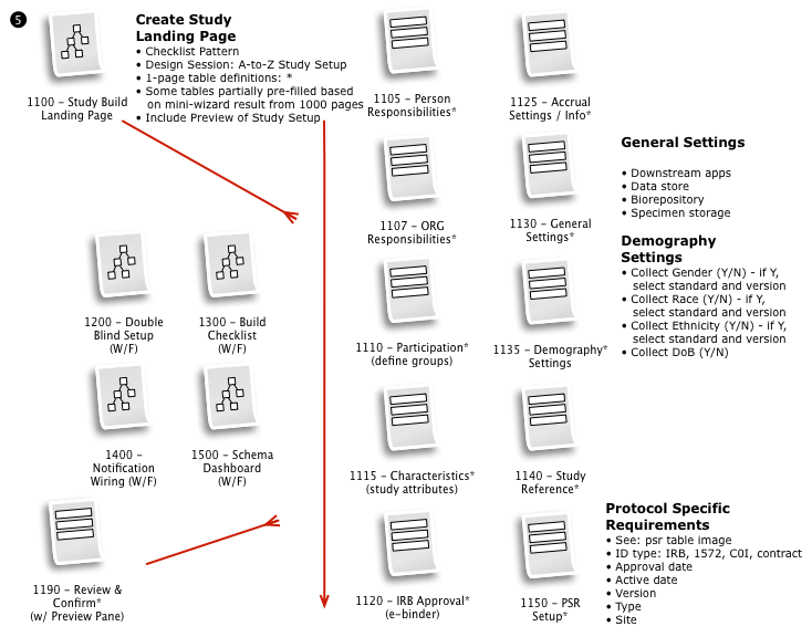
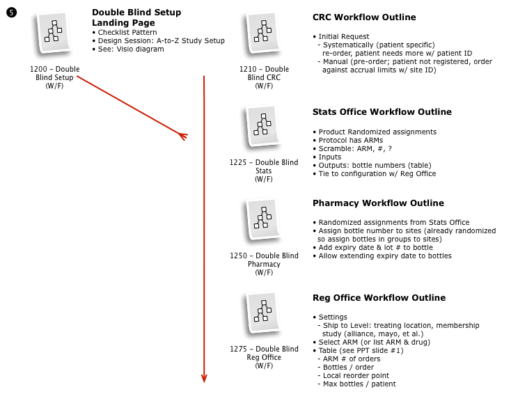
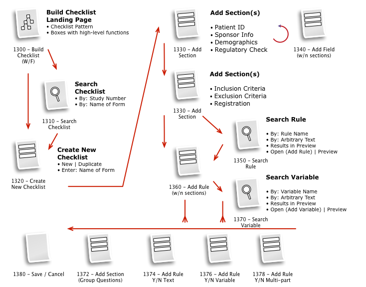
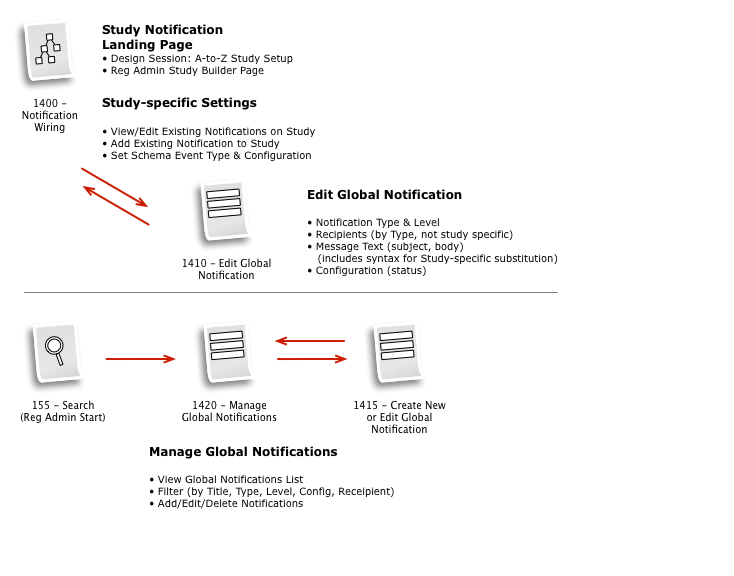
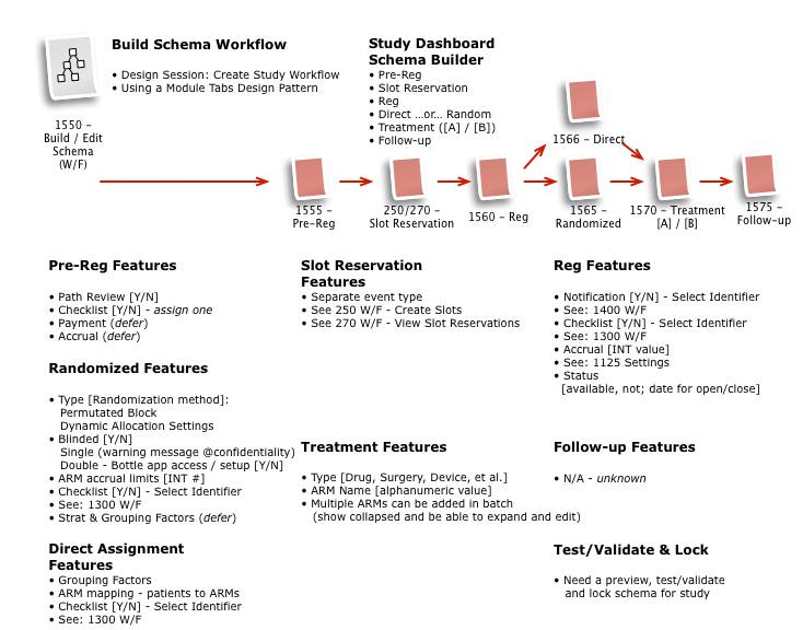
Working with a small team, we then iteratively mapped out a comprehensive workflow to digitally implement the customer journey, across multiple user roles, through the clinical trial process.
The process started with a series of workshop sessions and culminated in a 13-page set of workflow diagrams. These diagrams mapped out the flow and page collections that would fulfill the application requirements.
Dashboard Sketches
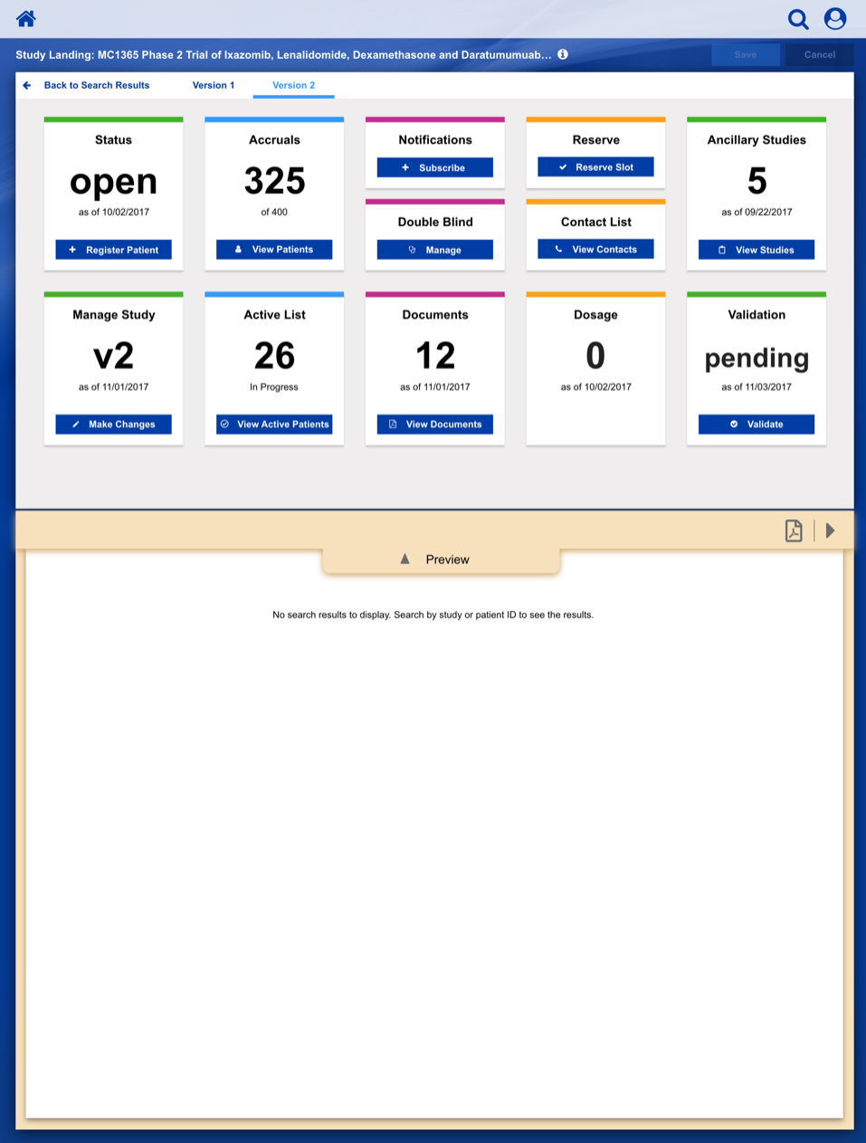
After settling on a basic layout and workflow, we started developing a series of wireframe sketches and a corresponding visual language, as shown in this illustration for a Clinical Trial Study Dashboard.
Dashboard Heat Map
We use 3M’s Visual Attention Software to analyze and predict end-user visual attention and scanning order, as they are presented with a user interface; this ensures that the important control surfaces are observed by the user with a casual glance.
Responsive Design
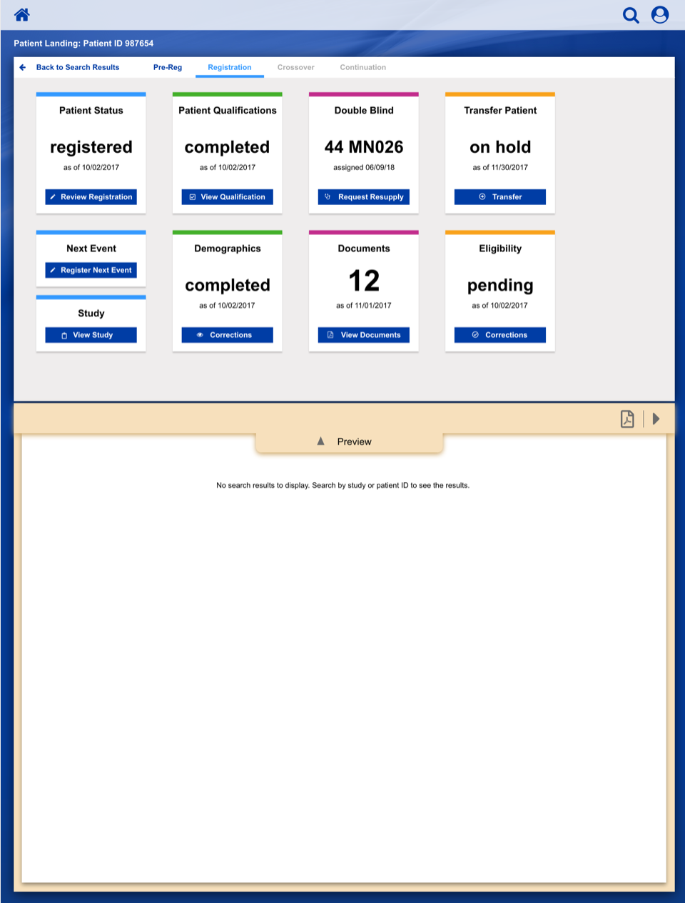
These are responsive design examples that highlight the importance of not just being "mobile friendly", but designing "mobile first" to elegantly support a variety of screen resolutions and aspect ratios.
Registering a Patient into a Clinical Trail
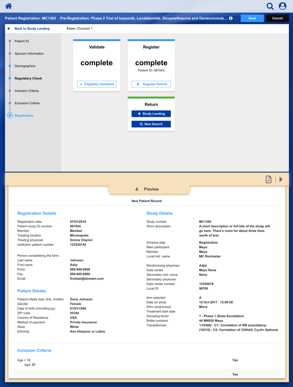
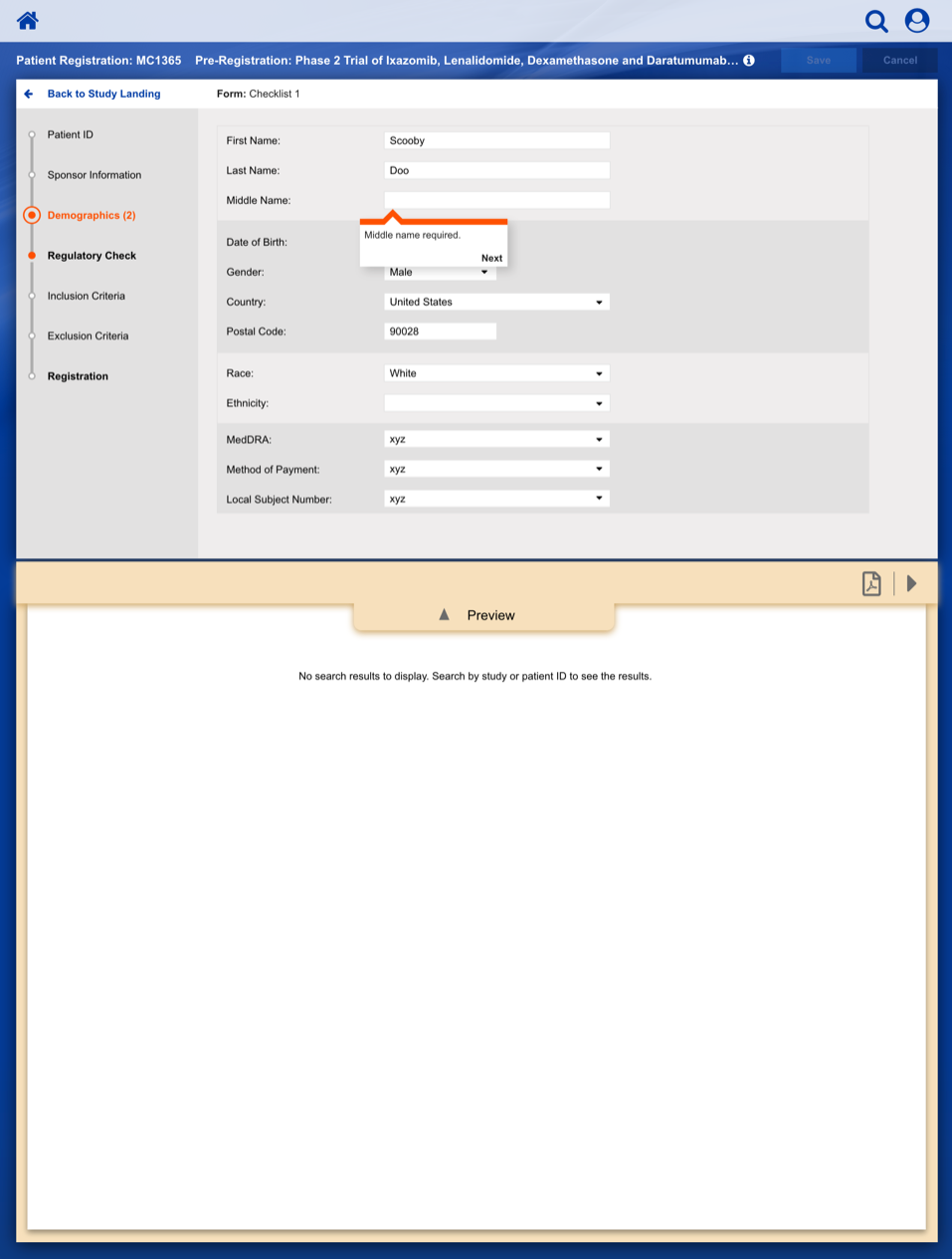
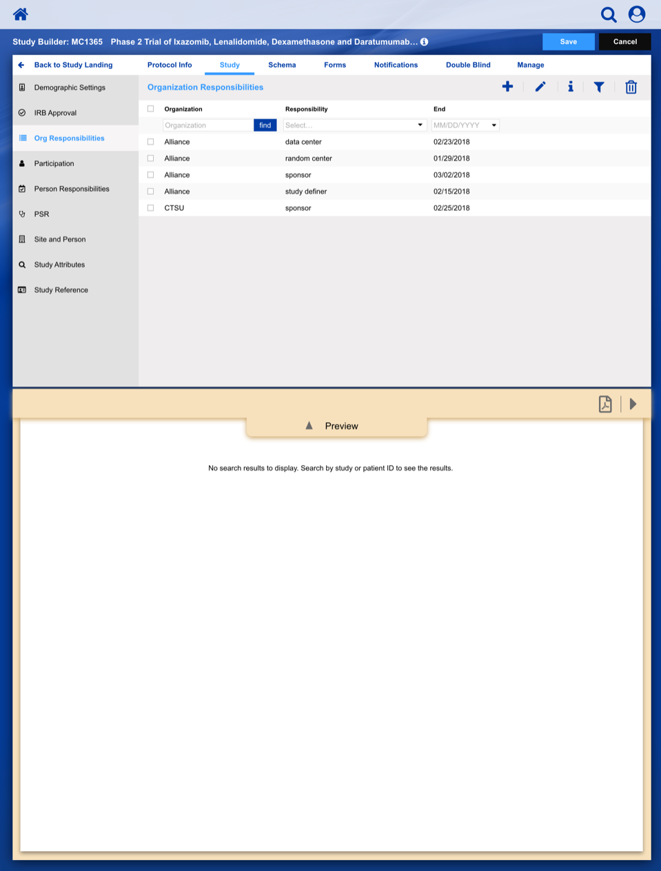
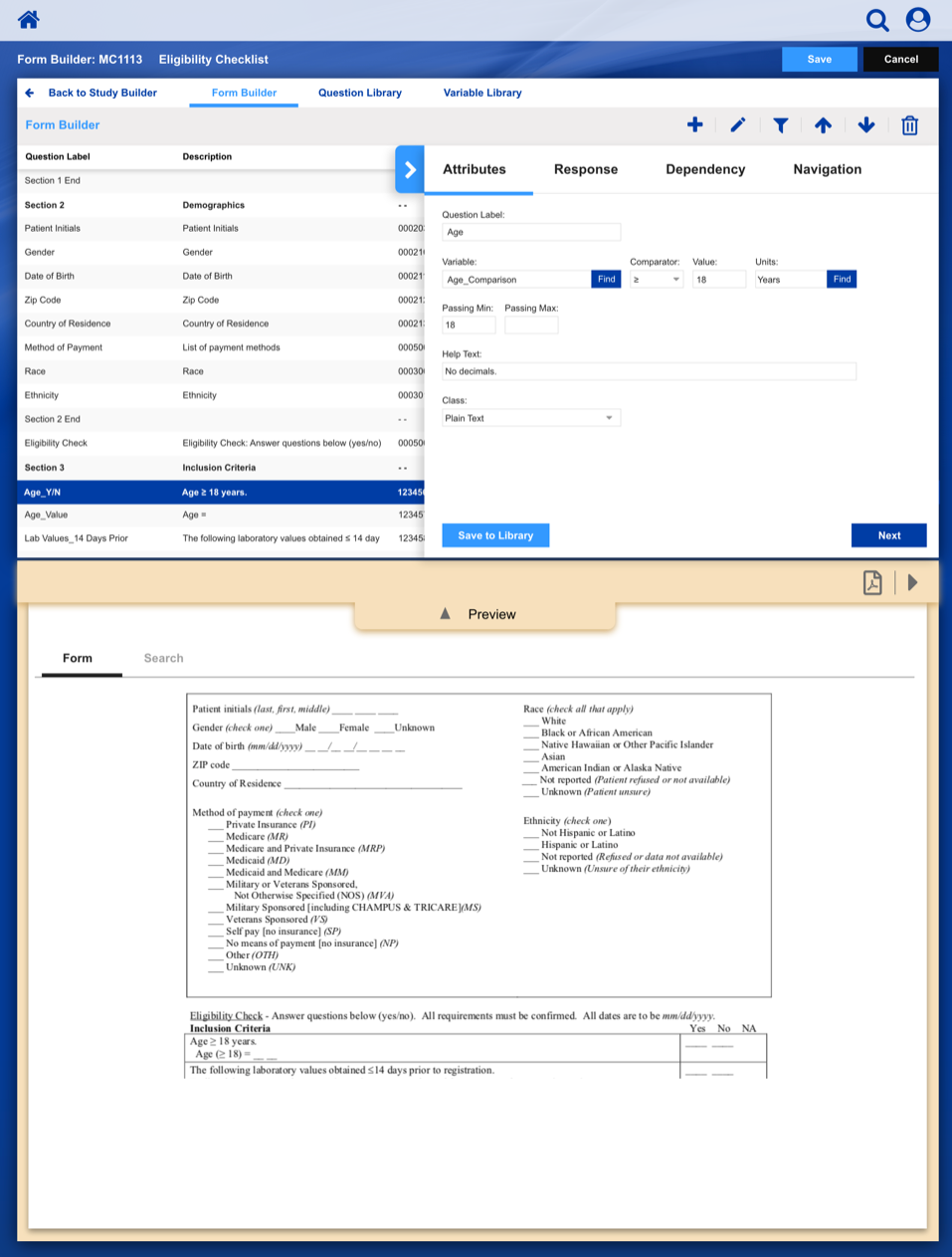
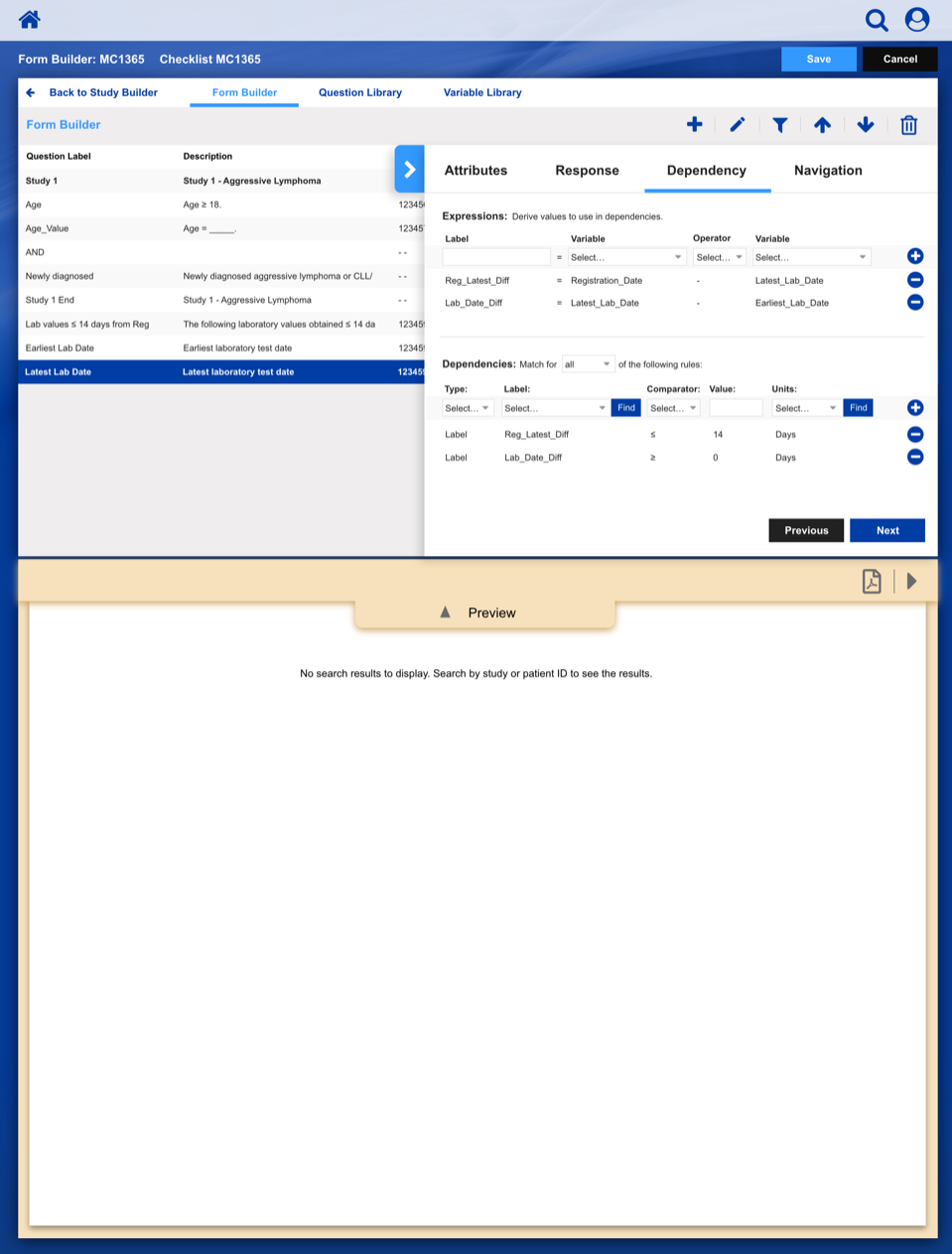
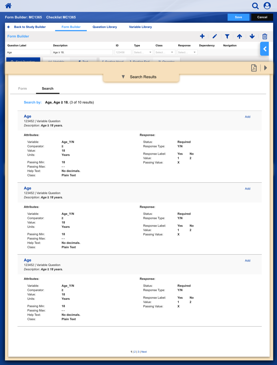
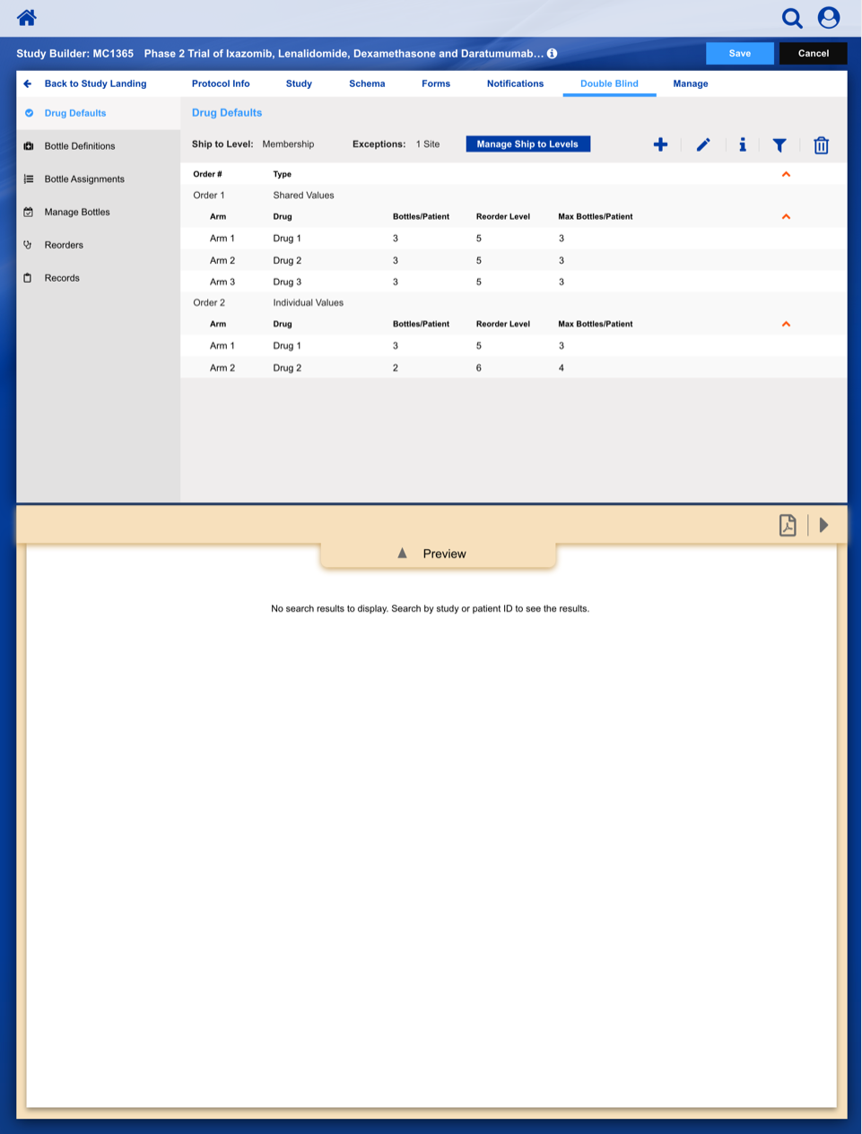
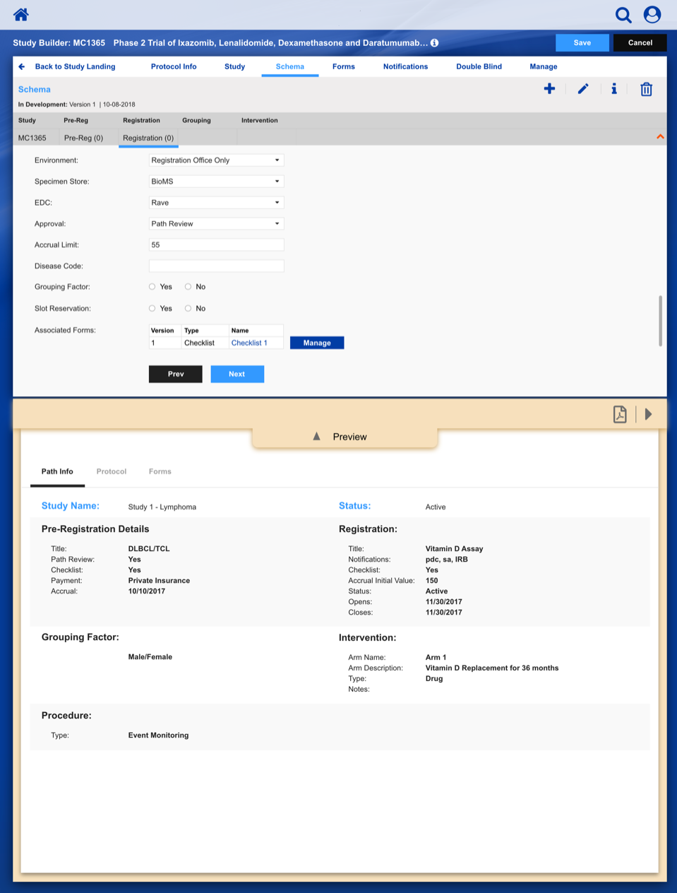
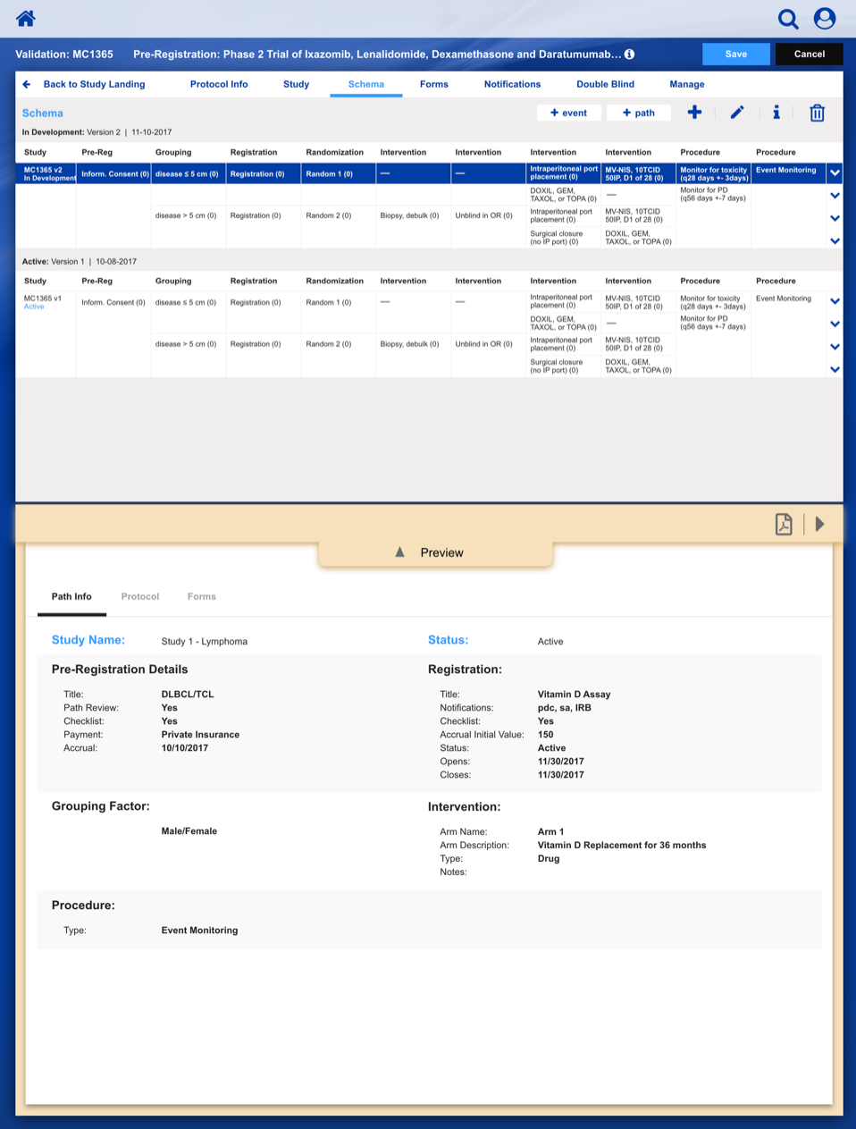
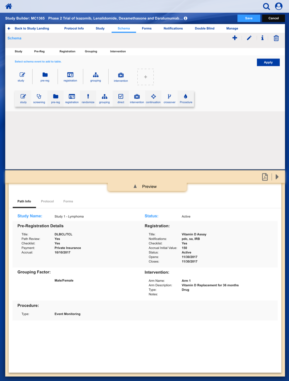
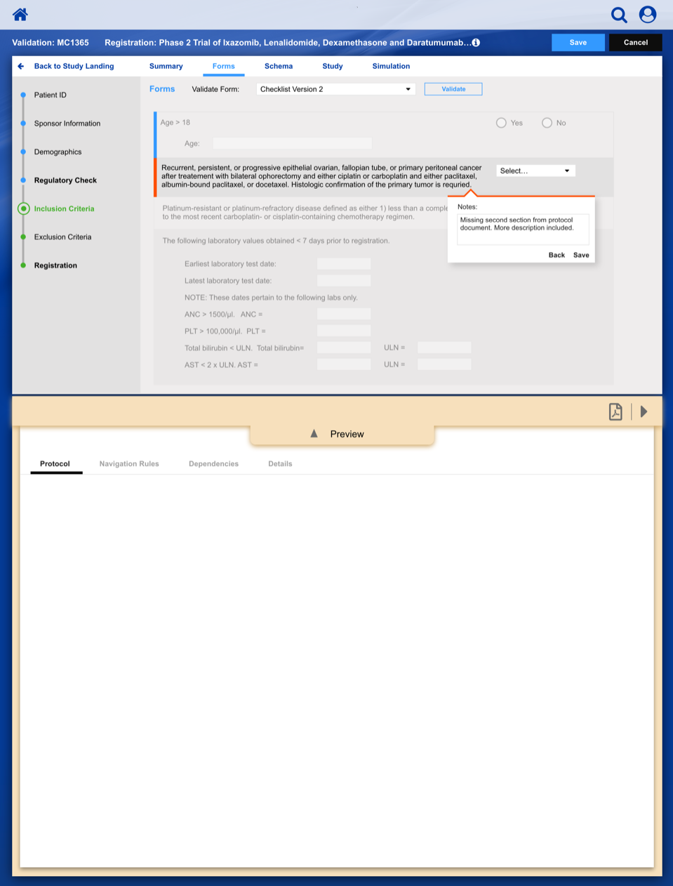
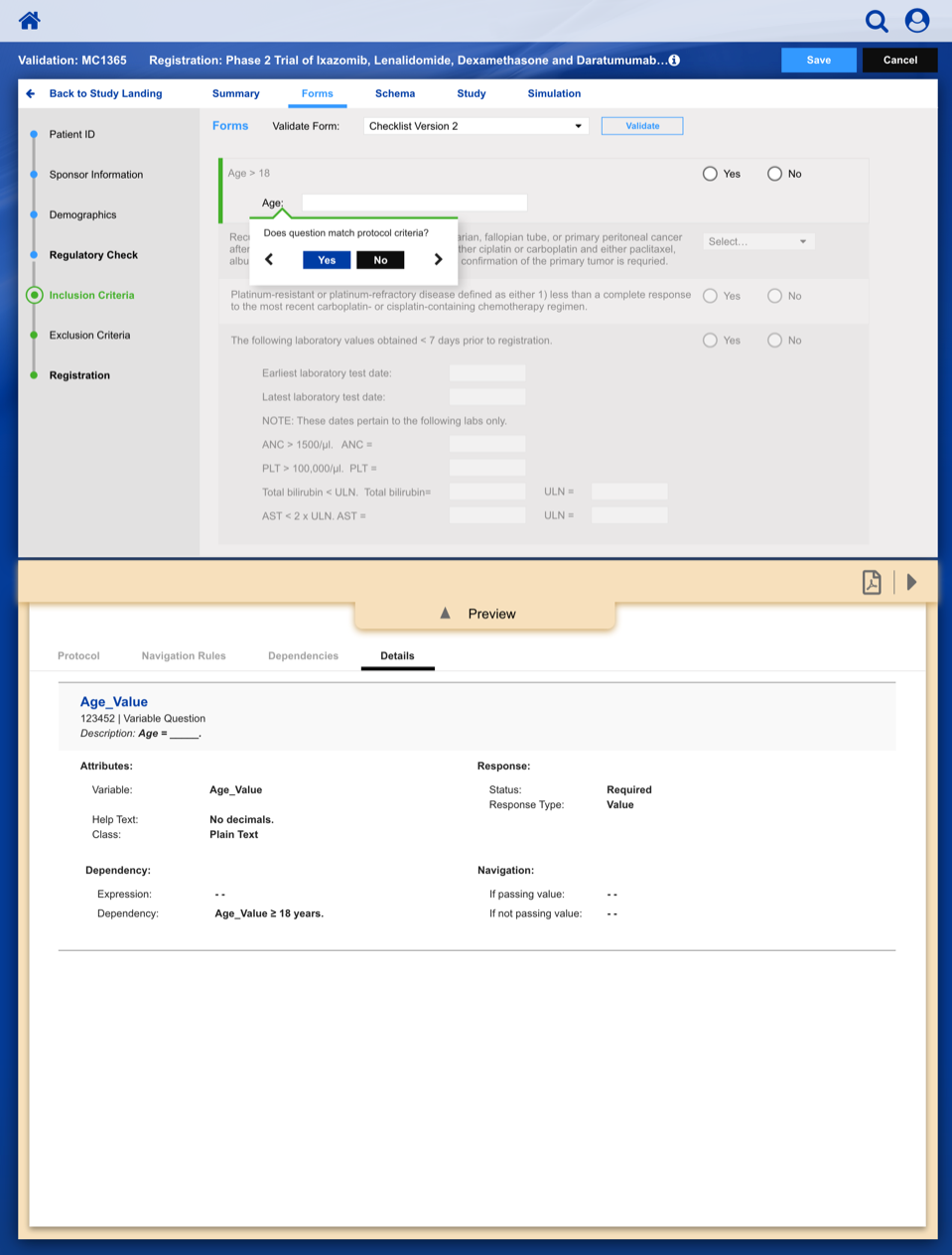
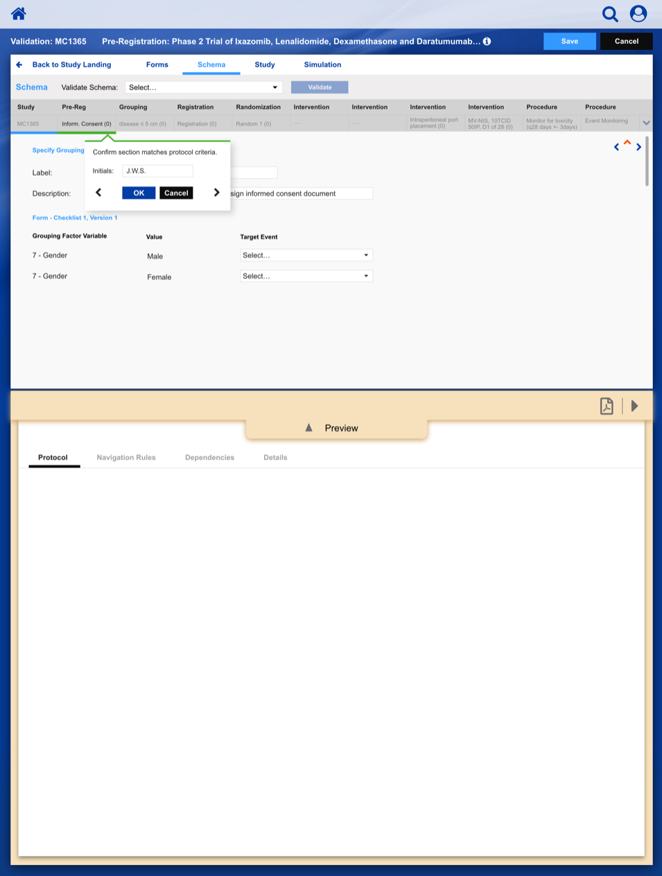
The slideshow demonstrates a variety of visual cues carefully designed to draw attention to Patient Registration details, including validation, possible entry errors, as well as the ability to undo changes.

