Overview
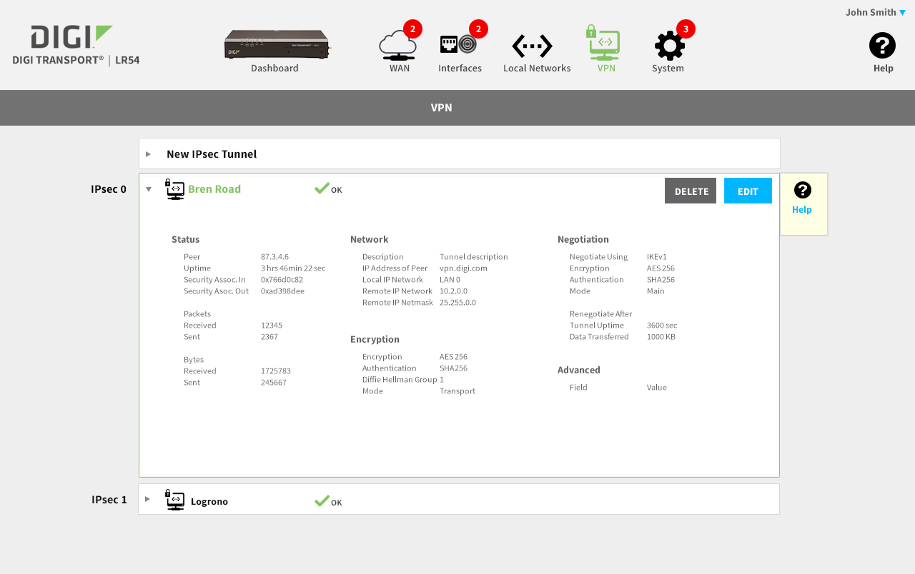
The project started with designing a wizard-based initial out-of-box-experience. As development on the underlying system was underway, we moved quickly and leveraged a visual language we developed for a previous product from the same client; this shows a portion of the design specification for the development team.
Click the Play button to view a design walk-thru with commentary.
Watch the 5m video walk-thru with commentary.
Main Success Scenario
Enable confident installation and management of a complex networking product by a wide spectrum of installers and end-users. Key design elements include surfacing important features to a non-expert audience.
UX/Design Highlights
We performed the initial user experience research, interviewing field sales engineers, followed with iterative designs, co-developed with product owners.
Our team of seasoned user interface developers built a working set of “Reference Pages” (i.e. working web app) that the client’s own development engineers merged into the device’s embedded system, as features were being developed.
Using our working “Reference Pages” we were able to conduct usability studies ahead of full feature implementation by the client’s product team. This project demonstrates our expertise in a wide variety of disciplines and is the third commercial product for which we lead the user experience design for this client.
2 Patents Issued
Patent Awarded Packaging
Process
Building on our initial user research, our iterative design process used a combination of sketches, hi-fidelity story boards, and heat mapping to work through design decisions.
Dashboard Sketch
After the initial out-of-box-experience (OOBE), the customer uses the Dashboard for monitoring and on-going configuration tasks. We started with a series of Balsamiq sketches to start the discussion with the product owners.
Dashboard Storyboard
After settling on a basic layout and workflow, we started developing a corresponding visual language, as show in this illustration for the Dashboard.
Dashboard Heat Map
We use 3M’s Visual Attention Software to analyze and predict end-user visual attention and scanning order, as they are presented with a user interface; this ensures that the important control surfaces are observed by the user with a casual glance.
Responsive Design
These are responsive design examples that highlight the importance of not just being "mobile friendly", but designing "mobile first" to elegantly support a variety of screen resolutions and aspect ratios.
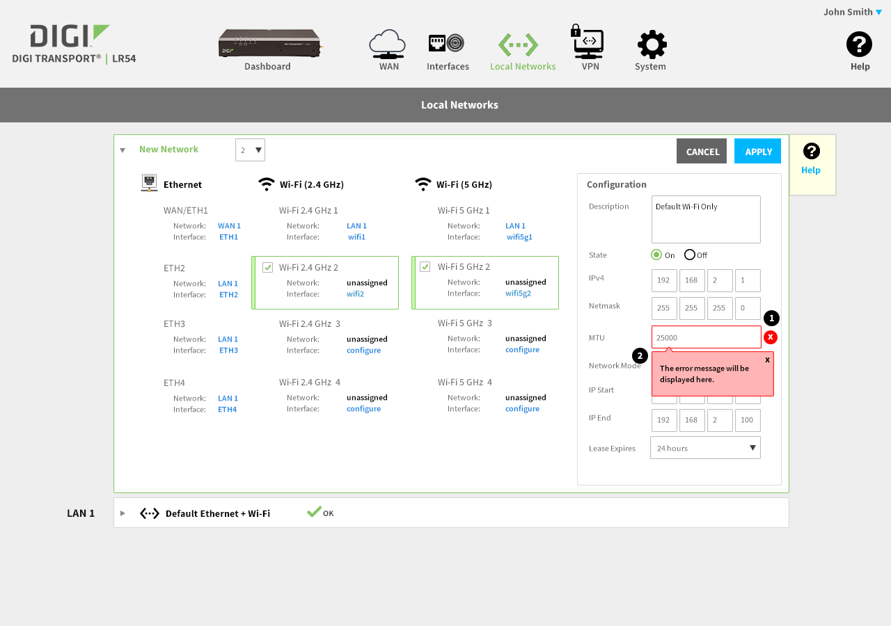
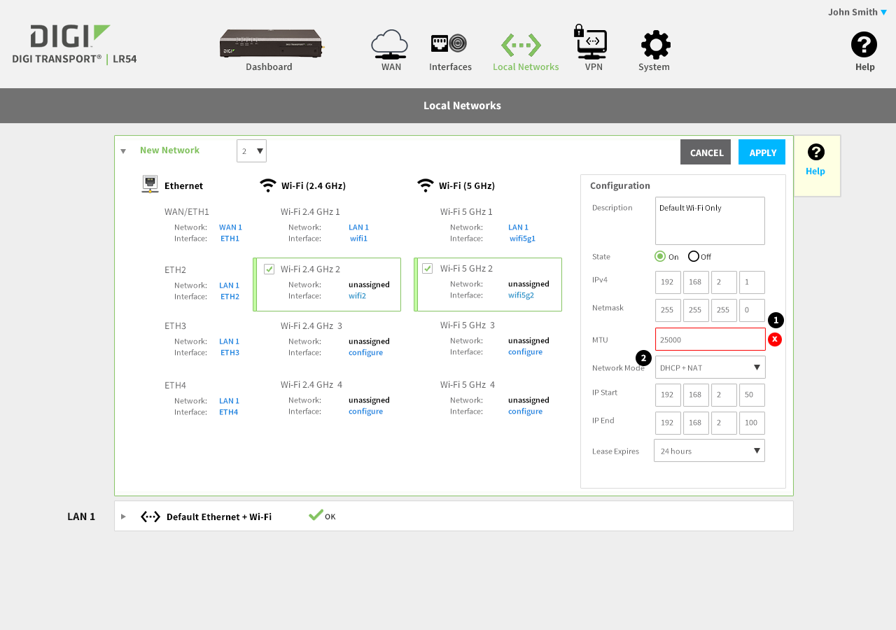
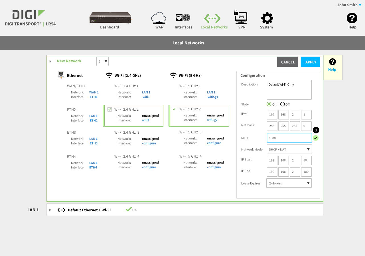
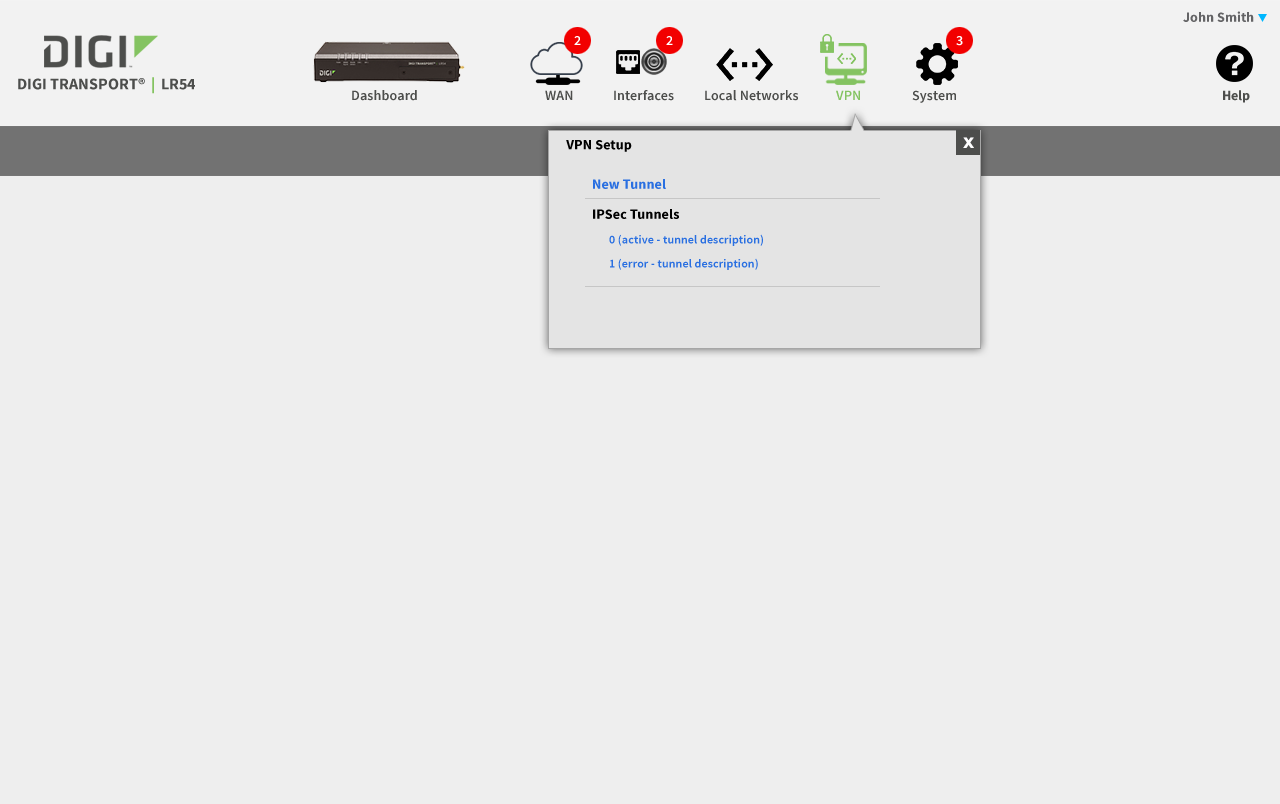
Editing a Complex Configuration
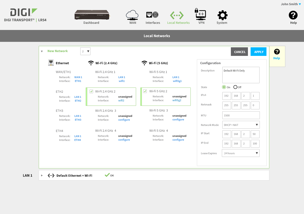
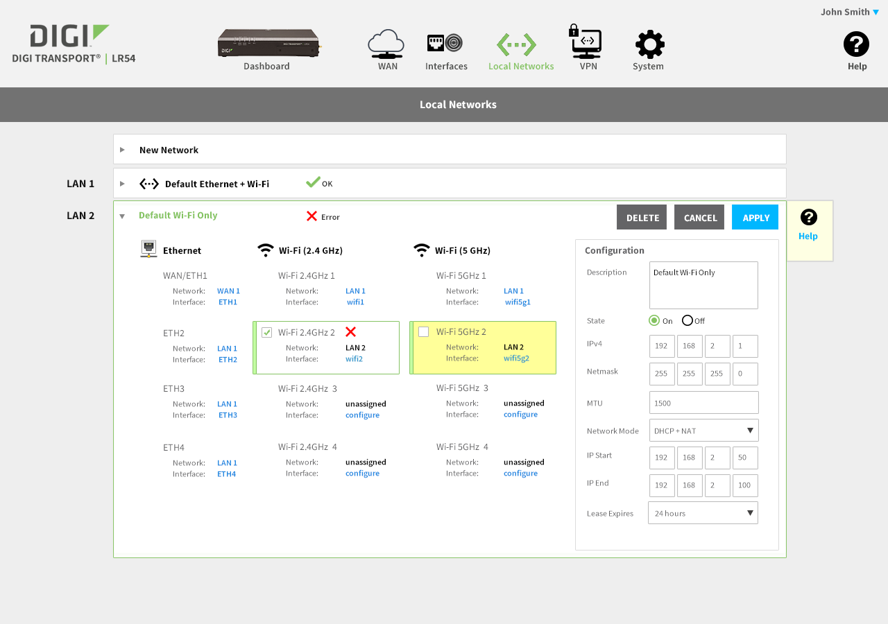
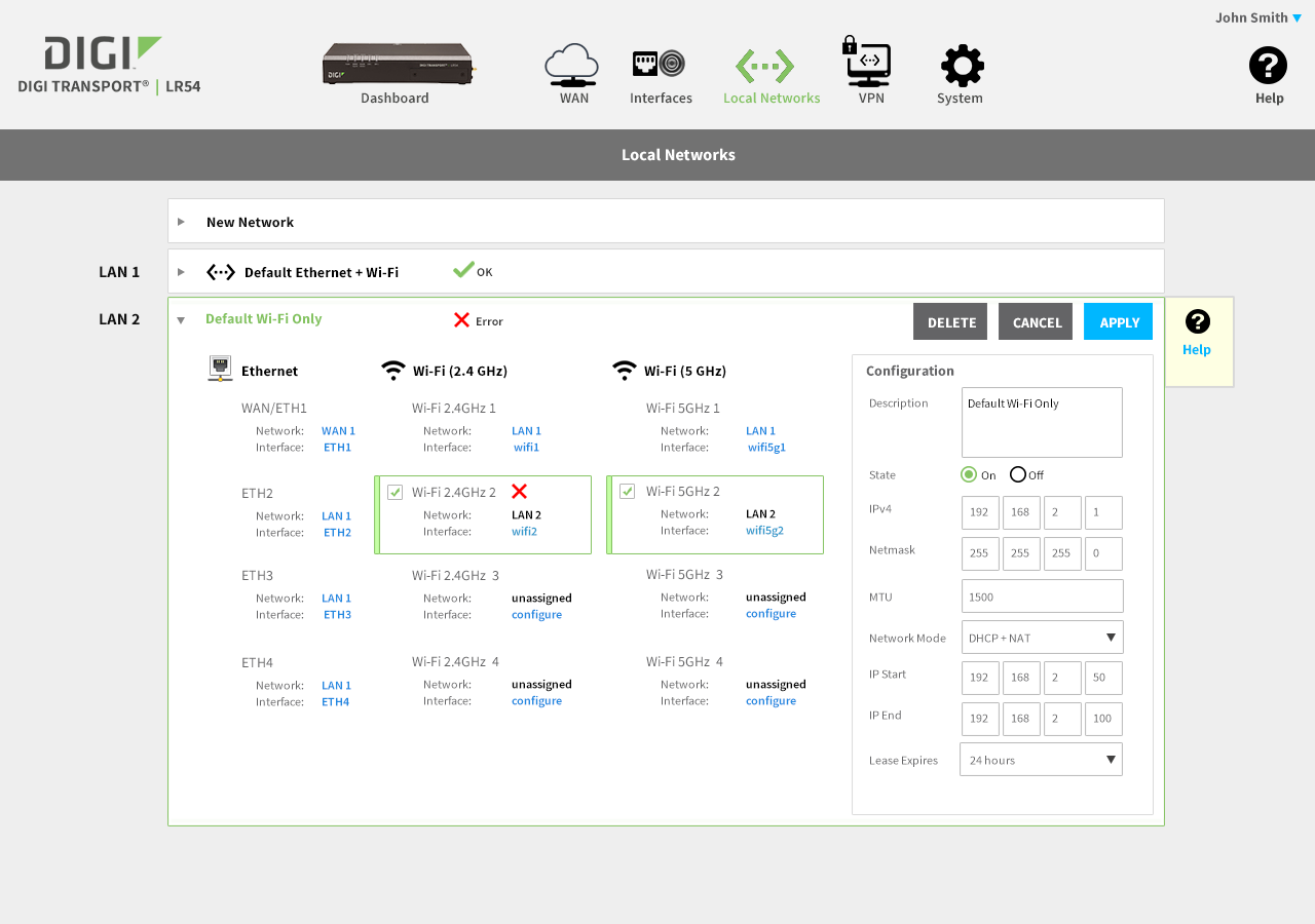
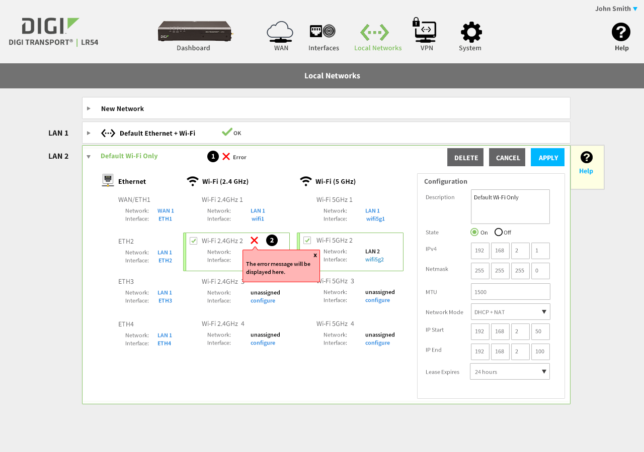
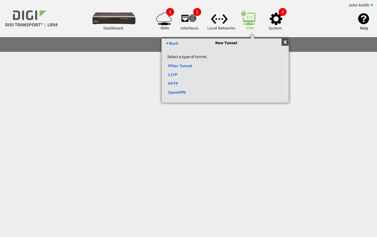
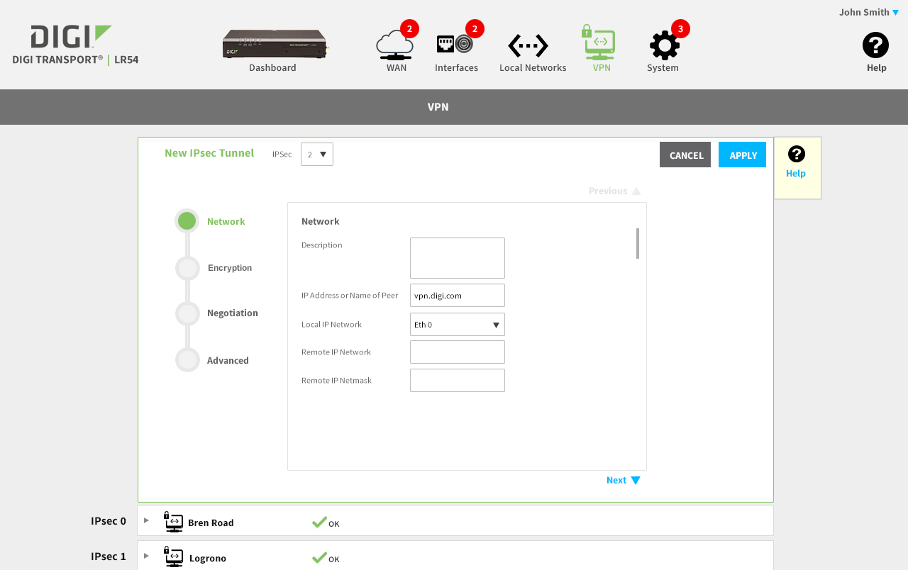
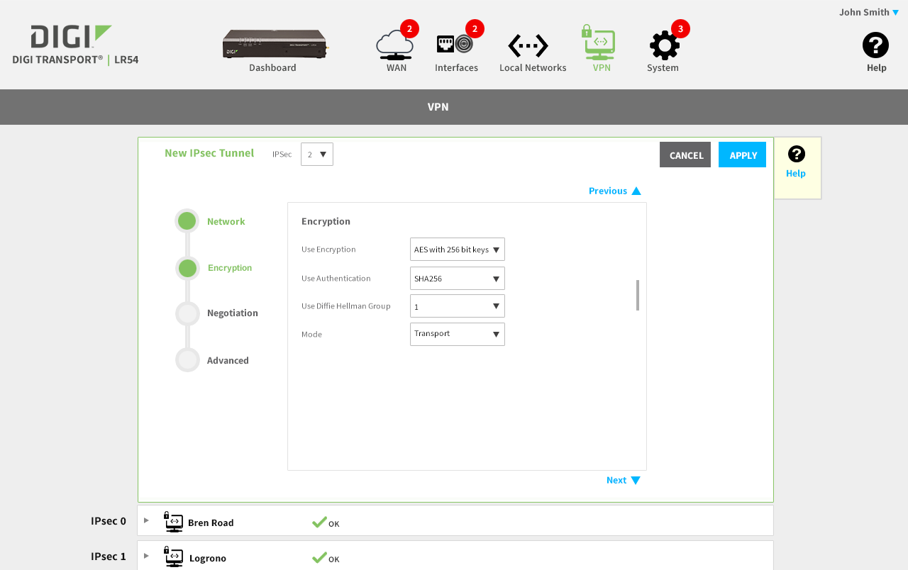
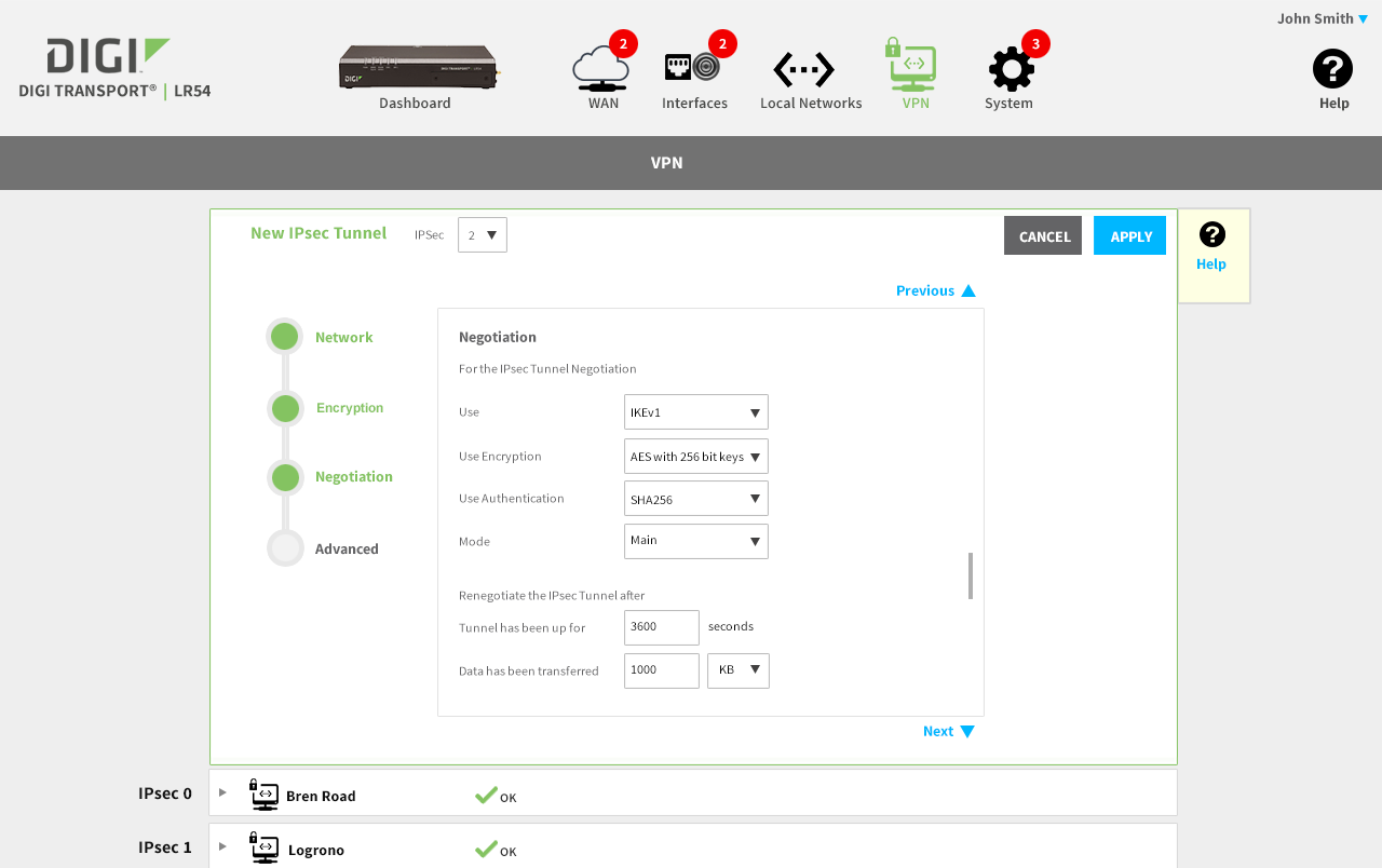
The slideshow demonstrates a variety of visual cues carefully designed to draw attention to device configuration edits, including validation, possible entry errors, as well as the ability to undo changes. Later, we demonstrate a series of "mini-wizard" pages that affect a multi-step process to build a more complex configuration change.
